
background
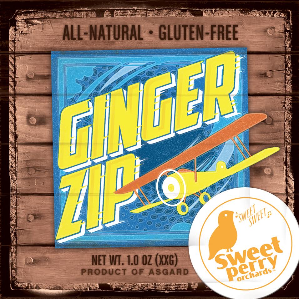
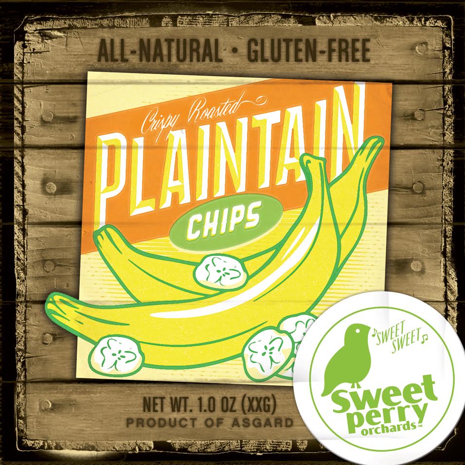
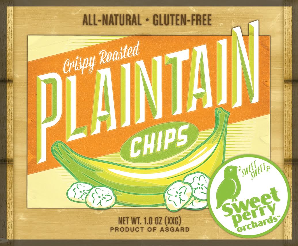
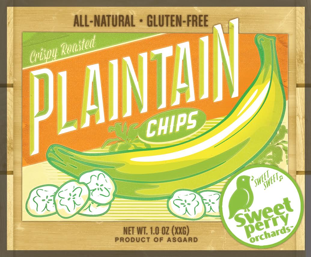
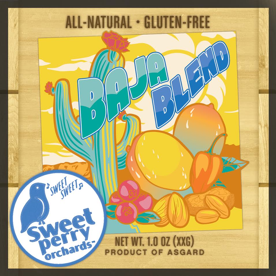
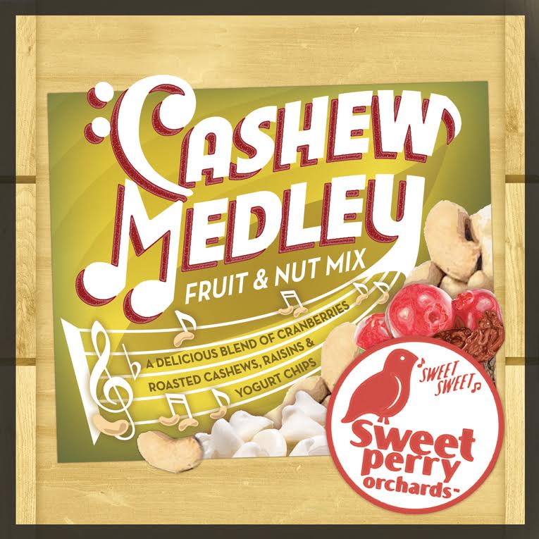
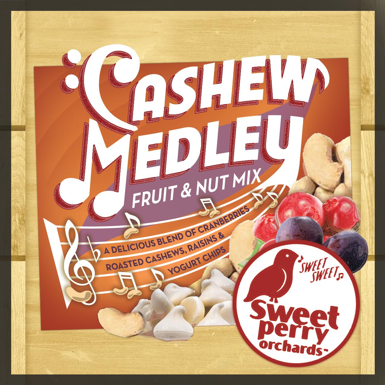
GoPicnic reached out to create a series of illustrated packages for a rebranded line of snacks for their to-go picnic boxes. These products were sold in stores big and small and needed to make an impact within an eclectic environment of snack packaging. In all 6 different packages were designed and executed for production and are still in current circulation within various GoPicnic brand assorted boxes.
mission
Inspired by vintage wooden fruit crate labels, these packages integrated exciting typography heavily into the illustrations and design. The frame of the packages were meant to feel like the sides of a wooden crate while printing imperfections helped aide in the vintage appeal.
Agency: JonWarobick
Packaging Design
Interior Design
illustration
Proposal and Development

Pitched Media Approaches

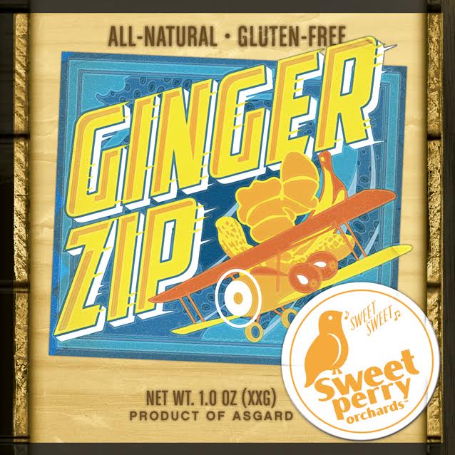
Illustration process options
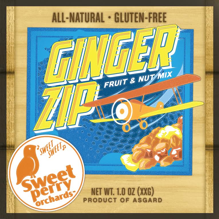
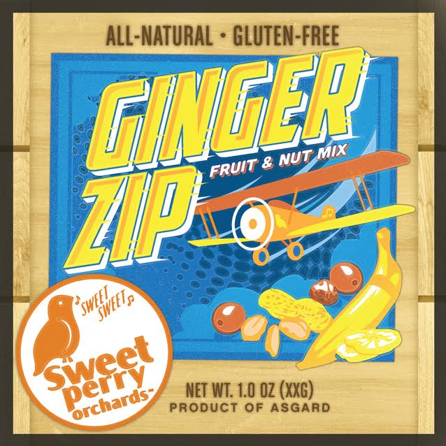
Final Packages


wanna see more?
Check em out
